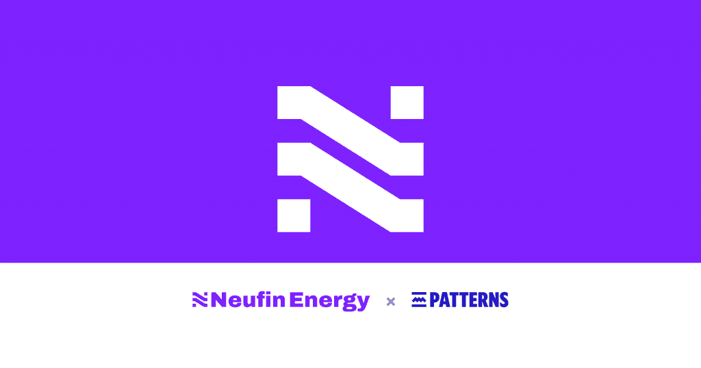
Client: Neufin Energy · Studio: Patterns Studio, Singapore · Design: Kedar Nimkar
Scope: Brand strategy · Logo and visual identity · Design system · Website design and development · Brand Storybook · Tone of voice · Photography and illustration guidelines · Creative tools · Sales templates
Last week, Neufin’s co-founder Rahool Gadkari introduced the company’s new brand. This is the design story behind it: how we arrived at the N-Slash, why it is drawn at 32°, and how that one angle became the system behind Neufin’s website, sales material and everyday communication.

The brief behind the logo
In 2022, when Neufin was just starting out, I designed its first logo, the teal stepped N, in a personal capacity. As the company moved into energy, an interim yellow E replaced it. By the time Neufin asked me back, it had two logos, and neither said much about the company it was becoming.
In our first conversation, Rahool pointed to a harder problem underneath the logo. Neufin wins business by explaining energy more clearly than its competitors, yet every template and deck the team had made drifted off-brand within weeks. A new logo file would not fix that. Neufin needed a brand its sales team could use correctly without a designer in the room.
So the brief had four parts:
- Design an identity strong enough to earn a commitment
- A visual system that extends into every format the team uses
- Robust system that keeps it consistent after handover
- A new website designed and built alongside it.
The N with a slash
The N is the first letter of the name and the one idea from my 2022 mark that still held up, so keeping it carried Neufin’s history forward. The slash carries the promise. A band falling from high to low is a energy bill coming down and staying down, and two parallel bands are the link Neufin makes between businesses and the solar and wind plants that supply them. A slash also cuts through, which is how Rahool described the brand’s job: to cut through the noise of buying energy in India.
Starting with brands that have earned trust
Before drawing anything, I collected the marks of companies people trust with things that have to work: 3M, Michelin, MRF, Havells, Kohler and Black+Decker, alongside India’s energy brands, from JSW Energy and Tata Power Solar to Waaree and Azure Power.
Two patterns stood out. The marks that last are heavy and simple, with upright letters and symbols that survive being stamped on metal or shrunk to a favicon. And the energy sector has settled on green, blue, yellow and orange. Nobody owned violet.

Drawing the N-Slash
It is rare to return to a mark you drew four years earlier with a clearer view of what it should become. The stepped-band N from 2022 still held the right idea, and the interim logo had dropped it, so that is where I began. Rahool describes the new mark as a homage to the first. Over 4-5 rounds, I redrew the N on a fixed grid, thickened the bands, reduced the steps to two and squared the ends, until no part could be removed without losing the N.
The symbol sits on a grid of three columns and five rows. Its unit is the width of one square terminal, and the same unit sets the clear space around the logo, so the mark carries its own spacing rules wherever it is used.

On the grid, that story became one number: 32°. The same angle carries it onto the sales slides, where a band drops from ₹9.40 a unit on the grid tariff to ₹6.20 with Neufin, so the logo and the price chart tell the same story.

An angle with a reason behind it is easy for a team to remember and to defend in a meeting. It also gave me one rule to build the rest of the system on.
Type and colour
The wordmark is set in Archivo, heavy and tightly spaced, with Neufin stacked over Energy to form a solid block beside the symbol. IBM Plex Sans handles body text, and IBM Plex Mono sets tariffs and meter readings, because in this business the numbers carry the argument.
For colour, I chose Electric Violet (#7E22FF), close to the colour of an electric arc and unused by any major energy brand in India. Near Black and Warm White keep it in check, four accent colours handle charts and campaigns, and every text pairing meets WCAG contrast standards.


One angle, applied everywhere
Once the angle was fixed, the rest of the system followed from it. The band from the symbol became a stripe that crops photographs, divides page sections and carries the price drop in charts. Illustrations of pylons, turbines and factories are drawn on the same 32° perspective. Photography shows real Indian sites and the people who run them, in one of three treatments: natural, violet wash or duotone. On the website, a short pulse of violet light runs down the stripe, like current along a line.


A website designed for the phone first
Neufin’s buyers are business owners, finance heads and plant managers who often read on their phones, so every page was designed at phone width first and then widened for desktop. I designed in the browser and built the site in Next.js on the same design system as the guidelines: one set of colour, type and spacing tokens, a 12-column grid and shared components. When the brand changes, the website changes with it.


Tools in place of a PDF
Brand guidelines usually arrive as a PDF that nobody opens twice. Neufin’s problem was consistency in daily use, so I built tools the team can work with:
- The Neufin Brand Storybook, an online reference for the logo, colour, type, photography, illustration and tone of voice, built from the same components as the website.
- A photography composer that places any site photo into approved layouts at the right size for social posts.
- An illustration prompt builder that keeps new artwork inside the style.
- Sales templates for proposal covers, customer quotes, project slides and the price-drop chart.


The storybook also defines how Neufin sounds: plain, direct and closer to an advisor than a salesperson. The example line I like most is one where Neufin talks a customer out of a purchase: “At current battery costs, the numbers do not work for this site.”
I used AI to build these tools, and it is the reason one designer could deliver the strategy, identity, design system, production website and toolkit in about a month. The decisions, from the angle of the N to the wording of a button, stayed with me and the Neufin team.
What comes next
Lumen, Neufin’s software for tracking meters, plants and bills, is the first sub-brand, signed By Neufin Energy and built on the same system. Next, we take the brand into the product itself, with the aim of making energy management simple for India’s small and medium businesses.

Working with Patterns Studio
I have worked with Neufin since its first logo in 2022, and coming back four years later to build the full brand is the kind of long relationship I value most. Rahool and Rushil debated the exact angle of a band and the weight of a numeral, and they treated design as part of how the company sells. That care is visible in the result.
It is also how I prefer to work: directly with founders, from the first strategy conversation to the code that ships, with one person accountable for how every piece fits together. If you are building a company that needs a brand to carry it through a fundraise, a new market or a product launch, I would like to hear about it. Write to me at hello@patternsstudio.co or see more of the studio’s work at Patterns Studio website.

About the author
Kedar Nimkar
Kedar Nimkar is the Founder of Patterns Studio - an independent design studio based in Southeast Asia. He is design leader with 20 years of experience building digital products used by millions across Asia. He has led design at PropertyGuru, Jupiter, BookMyShow and Cleartrip, turning complex consumer problems into intuitive products.
Email the author